Have one more new Pink Paislee layout to share. Citrus Bliss is in a word: pretty. It is such a pretty collection of sweet hues and all things welcoming and, do I dare say it...spring!
I loved playing the black and white photos up against the soft hues of the pink and grey and the pop of orange polka dot.
These photos are a few of my favs of this sister and her littlest brother. He misses her so much now that she is at school full time all week. This is about what it looks like everyday when she comes home. They are such blessings to my life. Loud blessings. But blessings none the less.
So this collection has, again, a great Ephemera pack. Lots of die cuts and pattern pieces and citrus clear pieces. Can we say cute?
Phrases like the above clear piece won't even be a hoarding problem for me. I will use those up quick like. I love that see through and floating element on a page.
Wood veneer continues to be on trend and there is plenty to be had. So don't hoard. Share.
The little gold 'dots' are from the Gold Foil Bliss Thickers.
Had a blast creating with this collection and can't wait till it is out and available to help me think about spring.
January is almost gone. Will be sharing insight to my Memory Planner soonish.
Till then...have a fabulous day.
▼
1.26.2015
details ~ bella rouge
I created this page a little while back when Bella Rouge was first introduced. This is one of those photos that works perfect with the hues of the collection. Makes it one of my all time favorite Bella Rouge layouts. Bella is still shipping and can be found out at independent scrapbook stores as well as online. Scrapbook.com carries the line. It's a perfect set for all things Valentines, girlie, spring...
Today I posted over at PinkPaislee for their Designer Details category. This project is another great example of what I was talking about over there. The little details that can be found in all of my projects. Dimension.
Dimension is an element pretty much always found on my pages or albums. Those Frayed Flowers can't help but adding a dimensional flair to this page.
But besides what the products bring to my pages, I add my own dimension using a few different features. And all those details can be found at Designer Details | Pink Paislee today.
Hope to see you there. And drop me some love when you do.
1.22.2015
explore ~ atlas by pink paislee
Sharing another layout created for the Pink Paislee CHA 2015 Booth and the several mood boards that were up in the booth. Have I relayed that I love this collection Atlas? It will be one of those go-to sets of creative choices for me.
I took several of our photos from our holiday in Buena Vista this past summer. The photos are a favorite size for me: 3 1/2x 2 1/2-inches. It only includes a few photos but serves to bring us each right back here on this day we hiked into Maroon Bells.
As I was creating this layout while at CHA, in the hotel room with my peeps, I was stuck. And so my new sweet friend Gail, (you should really go and stalk her), suggested the letter thickers to fill in some of my spaces. Um..duh! of course! perfect addition. And thus began my love affair with the silver thicker letters that are part of Atlas. They are a flat silver color and actually look like metal. I am feelin' a hoarding issue coming on.
Atlas is one of those kits that is made up of some really great Ephemera pieces that can be perfect for a travel theme, or stand on their own to tell any story you have hidden in your camera roll.
So be on the look out for when this collection ships later this winter. Explore each opportunity of the stories you have to share and document your moments in life. I know I will.
1.20.2015
adventure ~ new atlas by pink paislee
Introducing Atlas from Pink Paislee...
This is a beautiful selection of papers, stickers, words, ephemera and gorgeous paper that will really bring a lot of mileage to lots of themes for telling your stories.
This collection is beautiful. It is so versatile to tell very specific stories as well as travel themed documenting. I am trying to make up trips for us to take just so I can use all the fun fun travel motif.
It comes with plenty of little embellishments to fancy up any page. I am a fan of layering, as you may or may not know. Anything to point to my story in my own personal style.
Do you not adore that camera chipboard piece? I made this layout up at CHA for the moodboard found in the Pink Paislee booth. I loved how it turned out.
Be sure to watch for this set to be in your local scrapbook store as well as online. I know you will fall in love with the paper selection and find that you will need this as much as I do.
Thanks for stopping in!
1.19.2015
marquee diy
Have you had a chance to play with the new MarqueeLove from Heidi Swapp?
They are fun letters available at Michaels that come all white and ready for you to diy to your hearts content.
And that's just what I did. Today I have a little tutorial of how I altered a few letters for a gift for a 17 year old male teen.
If you have any 17 year olds in your life, you may well have an idea as to the challenge it can be to buy for that guy?
But this is what I am came up with...
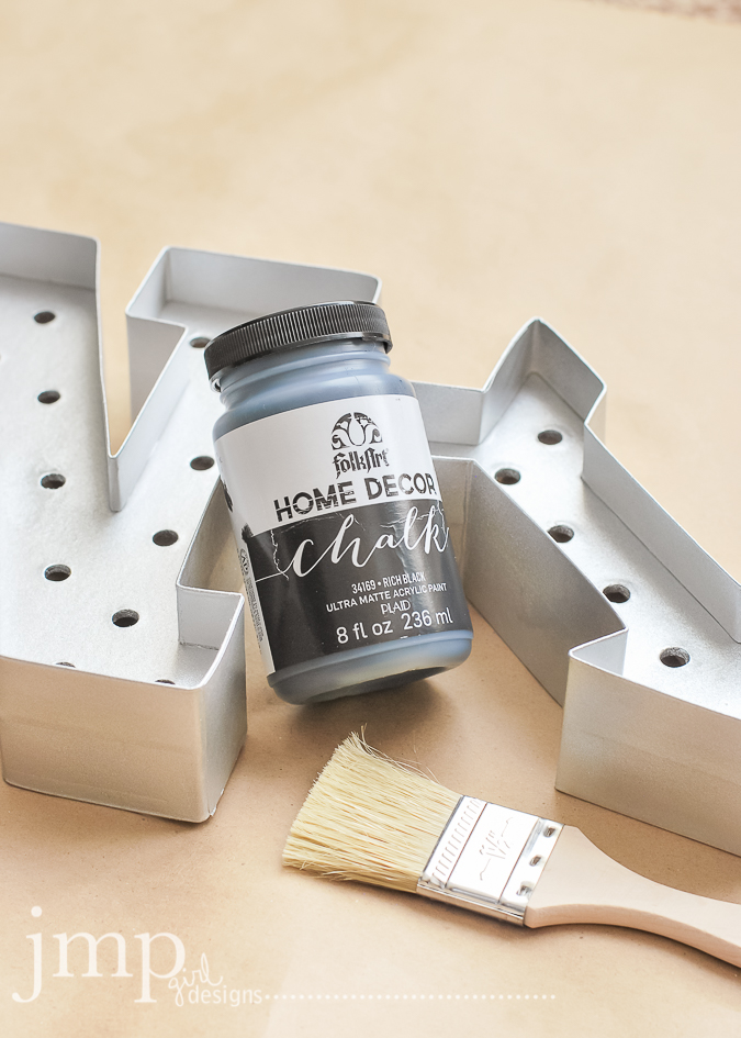
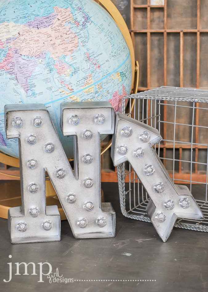
I used:
metallic silver spray paint
black chalk paint
a wide bristly paint brush
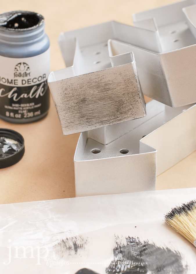
First: the letters were spray painted with the metallic silver paint.
Make sure they dry well between coats.
It took about three good coats to get them covered as I liked them.
Next, take the bristly brush and your choice of black chalk paint...
...dry brush the black onto the painted letter.
To do this I would dip the paint brush into the paint, and then dab off as much as I could but still have some paint on the brush.
As I applied the black paint, I would take a rag and wipe off the excess paint.
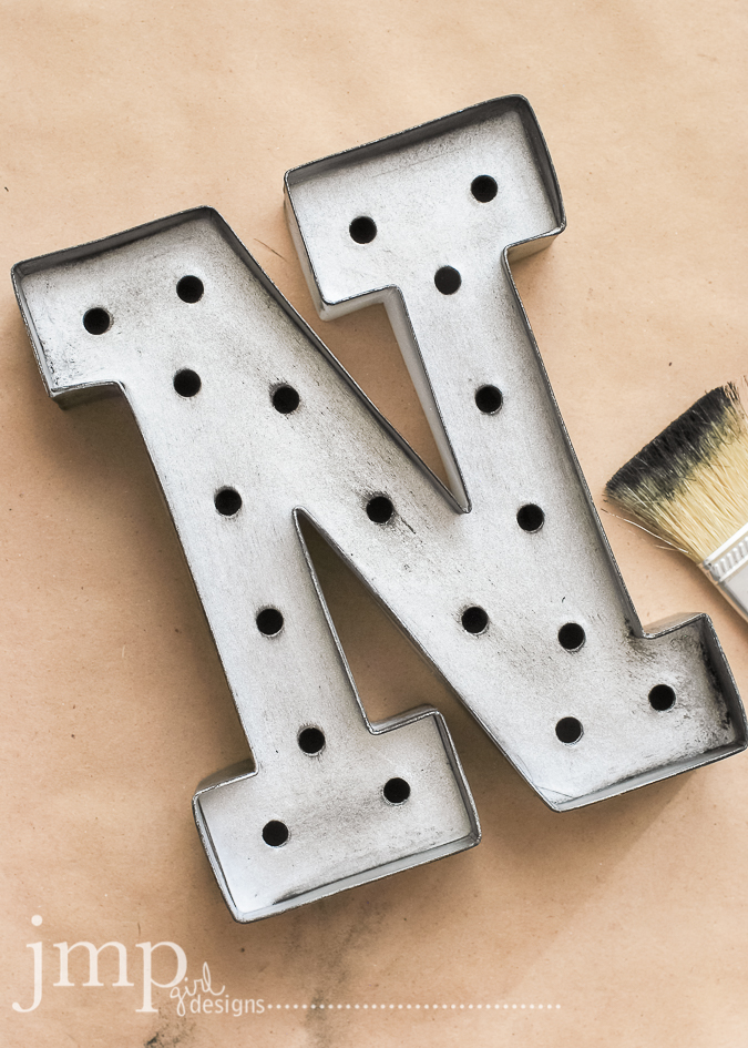
You can see here the completed 'N' and then a bit of the before and after on the 'arrow'.
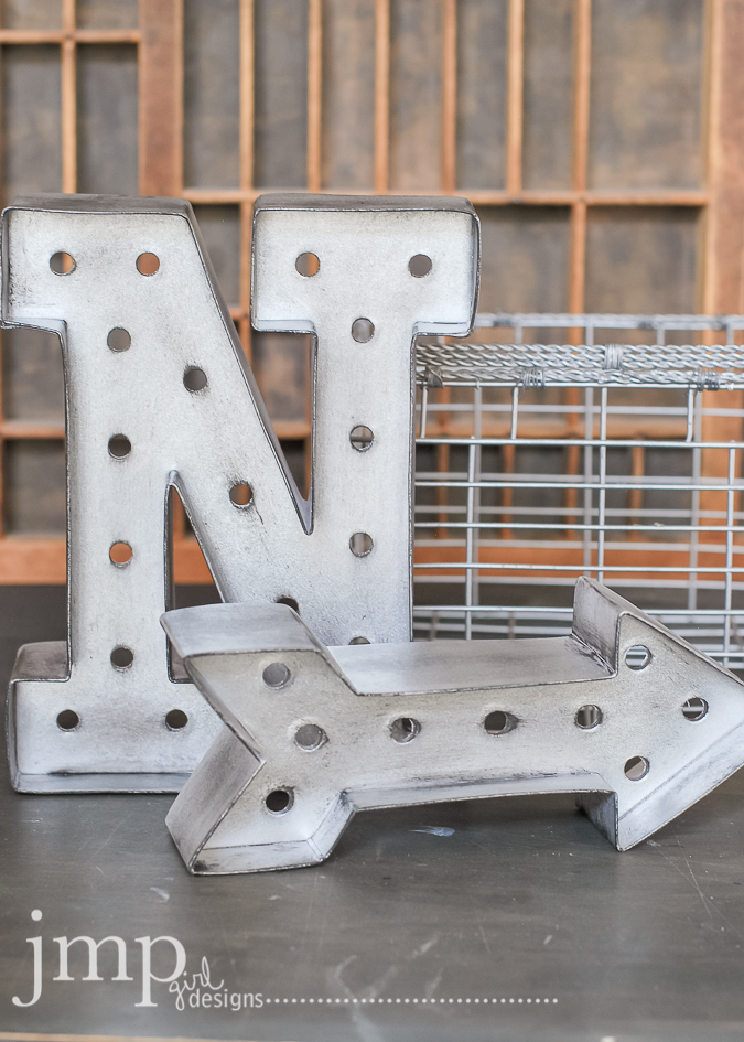
This is the end result before the lights were added. Did you know that each letter and icon comes with its own set of lights that are made specific for that light? It makes this marquee letter kit so easy and doable. Even IF the gift is for a guy.
Tada! and there you have it. Faux vintage metal letters ready for the giving.
I loved how these turned out and hope you found some inspiration here today.
Would love you to link me up with the letters that you diy!
and tag me on instagram too... @jamiepate ...share what you did with your Marqee Love.
1.07.2015
let's fly
Go here to see the rest of the entries and give it a try yourself!
For this page I picked up the pinks and yellows and charcoal from the mood board image. Pink Paislee Bella Rouge is mostly used to make this page. One of my methods for creating is to hone in on specific colors. Keep the page congruent with specific hues and enjoy that as a creative process. There was such a celebratory feel to the mood board and so sequins were a must have for this page too.
The reason for the page was to introduce my #olw (one little word) for the year: FLY.
I created a cut file and colored with black water color surrounded by splatters for Gold Color Shine. I love the simplicity of the page yet how that word really takes center stage for me.
Words always find their way on my pages. Just about almost always. These word strips from Heidi's collection at Hobby Lobby could never be a hoarding issue for me. I love them all and will use up every bit. Using words to emphasize creativity is huge for me.
A closer look at the sequin and vellum pocket. Just fun and perfect for a celebration type project.
So allow me to sum up a couple of things here...
firstly: go visit Jot and check out what many of the rest of the 2015 Jot Girls created for the mood board.
secondly: do you pick a word for your year? if you never have, I challenge you to do so. And then to join Ali Edward's year long class to keep you connected to your word. I promise you will not be disappointed.
o.k...for now...stay warm!
1.01.2015
december memory planner ~ heidi swapp
I cannot even begin to express how much impact this Memory Planner from 2014 has had on me this year. I feel like I am holding a real family treasure in my hand. It astounds me that a whole year, the blur, the one little thing every day, is right here and complete.
Added a post card from Starbucks. Loved their graphics this year. Picking up ephemera here and there will be great to have in years to come.
Printed Heidi's December Printable and adorned my pages with them . I adore having her art work on these pages throughout the year.
Here are my last pages for 2014::
it's such a sense of accomplishment this planner. this journey. this documenting what was.
This album is so full of thoughts.
quotes.
memorable photos.
the jotting down of the significant as well as the insignificant.
goals.
dreams.
hopes.
MEMORIES.
Some things I included:
I like to mimic the Zing printer by printing several photos in a 1-inch format. I think they are a cute perfect size for remembering these little moments.
Added a post card from Starbucks. Loved their graphics this year. Picking up ephemera here and there will be great to have in years to come.
Printed Heidi's December Printable and adorned my pages with them . I adore having her art work on these pages throughout the year.
Family photo. Remember how I goaled to add a family photo each month...well this capture taken on Christmas day at my mother's house is the most meaningful to me of all. All of us. In one place. At one time.
Added a tag from Pink Paislee's Merry&Bright. It was my fav tag and was becoming a hoarding issue so I thought it would just be safe here.
The 'merry merry' is one of my die cuts I did for Sizzix. It became a sort of theme for me this Christmas season.
SheReadsTruth is an online community of women with a daily devotional shared each day. The season of Advent was beautifully celebrated this year on their site. I found myself really drawn to a few of the graphics and photos and quotes. This side of the pocket page is mostly dedicated to the impact that had on my Christmas spiritually.
I am so thankful to Heidi for inspiring this process. For sharing her heart a year ago when teaching this in Anaheim. I ate up every word she spoke and have put it to practice by way of this planner this past year.
And the journey begins again.
You should all be more than aware of her Capture30 class available at BigPicturesClasses.
This online workshop is still available.
It's not too late to start at all.
I cannot encourage you enough to journey through this class and discover just what it means to stop the blur and write down one thing every day.
Happy New Year you all!!!


