

new Catherine Pooler Inks, Stamps and Dies
You know me. I'm a soft colors if any color kind of girl. If you want to view how someone can rock the brights...see my friend and Heidi Swapp Media Team Member Kim Jeffress. She's amazing.
As for me, I'm all about the softer hues of shades of color.
How To Soften Bright Stamp Ink Hues

Even for a little dude mini layout, I still took to using soft tones to tell this story.

I recently had the privilege of 'meeting' Catherine Pool in a cyber setting. I was not familiar with her product line. Her exuberance and enthusiasm took me in right away. I love how much she loves what she does and how eager she is to explain her product line and why she creates.
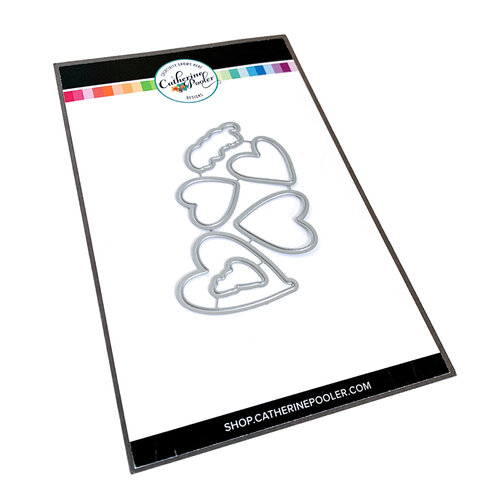
I was then sent a few items to try out. Especially the Dye Ink plus some heart dies and stamps.
Today let's chat about the Premium Dye Ink for a bit.

I was sent the following colors from her stamp ink line:
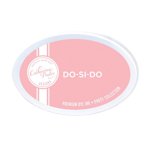
Do-Si-Do
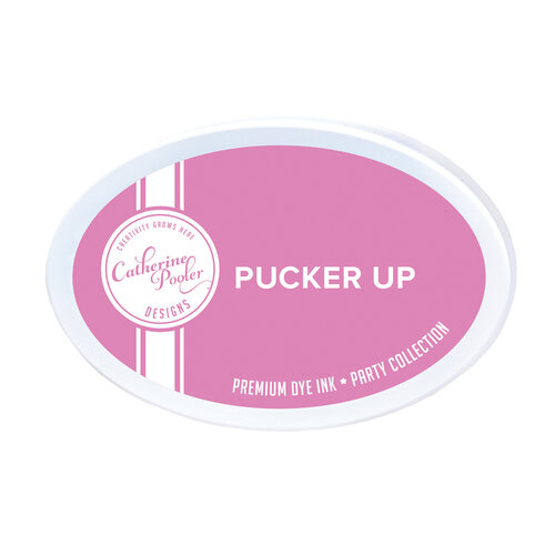
Pucker Up
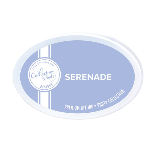
Serenade
To say these are pigment rich colors is an understatement. The stamp ink stamps very rich and vibrant hues. I was actually a little scared of them. Right!?!? I know! Just being honest here.
The ink pad is a foam pad so it transfers a lot of ink quickly. After stamping some samples and getting a feel for the colors I decided I wanted to try to 'watercolor' with them to see what results I would get.
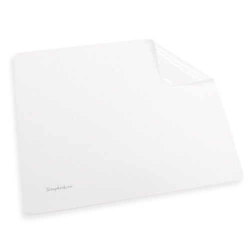
Using the ScrapbookCom Craft Mat I tapped (and when I say tapped I barely touched the craft mat surface) color on the mat. I then sprayed the color with my Distress Sprayer. Having cut several heart shapes with the Hip Hearts Die Set from watercolor paper, I then 'watercolored' the hearts. Pulling color and water through the colors of ink made for some beautiful variations of color. It was also just therapeutic. Creative play with paper, ink, and brush. This was all good on many levels. Plus a great way to soften the hues of the stamp ink and make them customized for me.


I hope you are inspired to grab some of the CP Ink Pads. Oh...and for sure get that Hip Hearts Die Set. It's one of the best heart dies out there I have found in awhile. More on that in another post.
Hey friends...when you shop these links below, I receive a small kick back from your sales from Scrapbookcom. There is absolutely no extra cost to you at all! But these commissions help to cover the costs of this blog and other expenses to provide you with these and other project ideas. I want to continue to bring you FREE inspiration. Shopping these links allows me to do just that. I can't thank you enough for your love and continued support.
***SUPPLIES***

Scrapbook.com


No comments:
Post a Comment