
as they always provide a creative exercise to move me out of my color comfort zone.
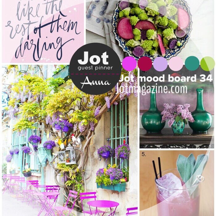
The hues for this board are not what I call my "go-to" colors. You just don't ever see me working with violet hues...like...every.
Thus the creative exercise.

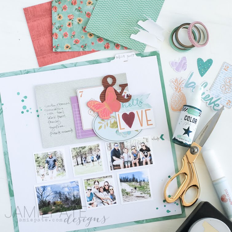
The exercise, to me, proved worthy of it's calling. Because colors were an issue for me I chose to go for a white card stock background. A piece of Maggie Holmes Shine pattern paper was matted behind the cardstock, a perfect mat for the the blue-ish-green of the mood board.
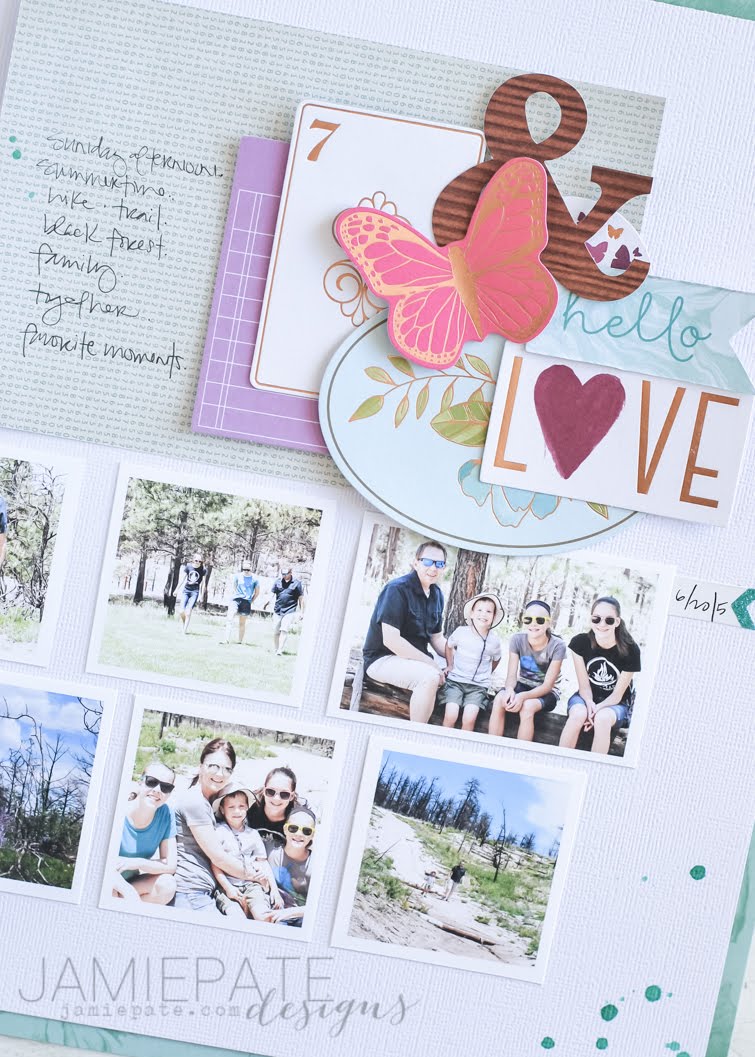
Surprisingly to me, colored photos worked for this layout. Usually I default to black and white when a color scheme is not my norm. But as I was looking to tell this story of one of our many summer Sunday hikes, I just found they would compliment where I was going with the page.
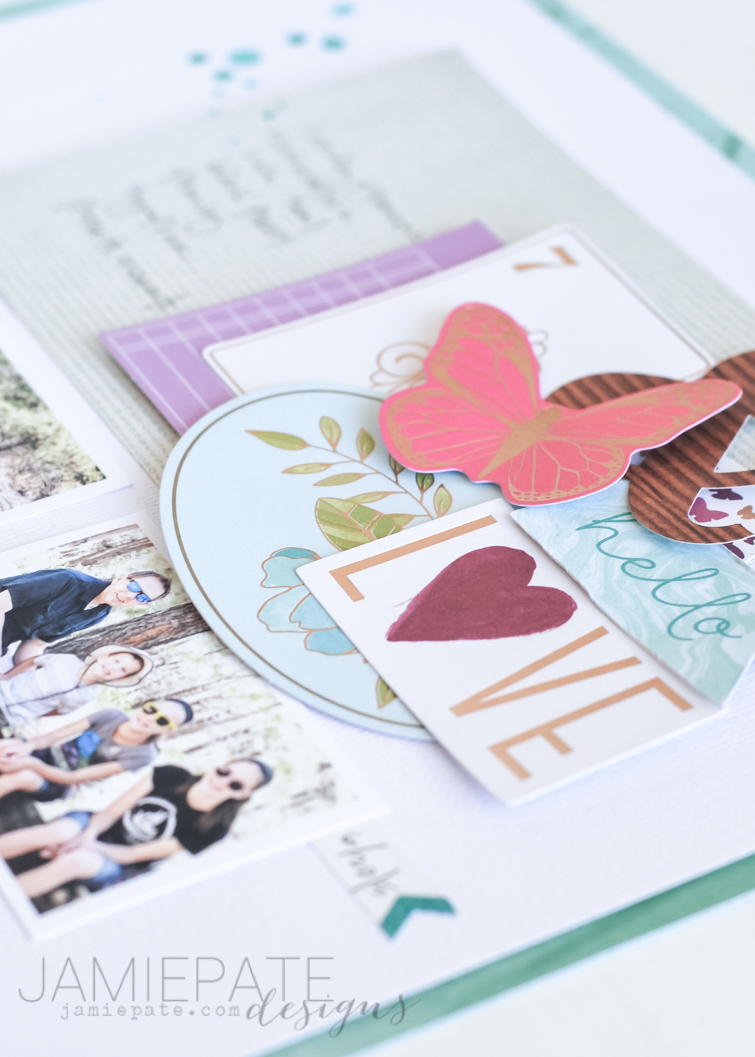
After the background, the mat, and the photos were figured out, I went about the embellishments. Also known as shopping my stash. I was sort of surprised that I was hoarding some embellishments that worked perfect with violets and greens of the mood board. Dear Lizzy came to the rescue. At this point it was just a matter of clustering my choices and I stepped away pretty pleased with myself.
So the moral of the story? Don't be afraid of a sketch or mood board just because it's not your style. Allow it to be a creative exercise and see what you can make of it. Let it move you in a direction that is not 'normal' for you. And above all, be inspired and enjoy the process.
Have an inspired day.
No comments:
Post a Comment