Showing posts with label jot magazine. Show all posts
mood board ~ jot magazine
2.15.2016
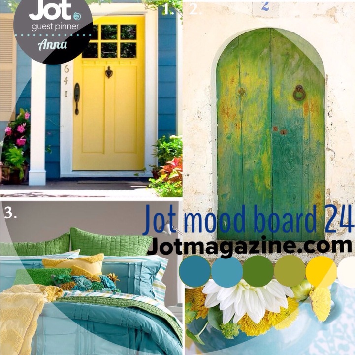
Jot Magazine's February Mood Board is up and happening over on the JotMagazine site. I love these challenges...
project life ~ jot magazine
1.10.2016

Jot Magazine continues to be such a beautiful and inspirational place for memory keeping. The team there is amazing. I continue to be inspired and drawn to their work...
today is a good day ~ jot magazine
9.14.2015
Hopefully you all have made your way over to Jot to check out the latest edition of that fabulous online publication. So full of inspiration.
issue 11 ~ jot magazine
9.08.2015
Jot Magazine came out last week with it's 11th issue. I am thrilled to be a little bitty part of that magazine. It is so gorgeous and beautifully produced.
july mood board ~ jot
7.02.2015
So inspired by this months Mood Board over at JotMagazine and hosted by Beshka! It is so beautiful and uplifting and inspiring. And so not the colors usually played with by this here layout creator. But who could resist!
This is a personal blog. All editorial content and projects are intellectual property of jamiepate . com. I do receive financial compensation and material product from American Crafts to develop my craft posts, but all ideas and opinions are my own.
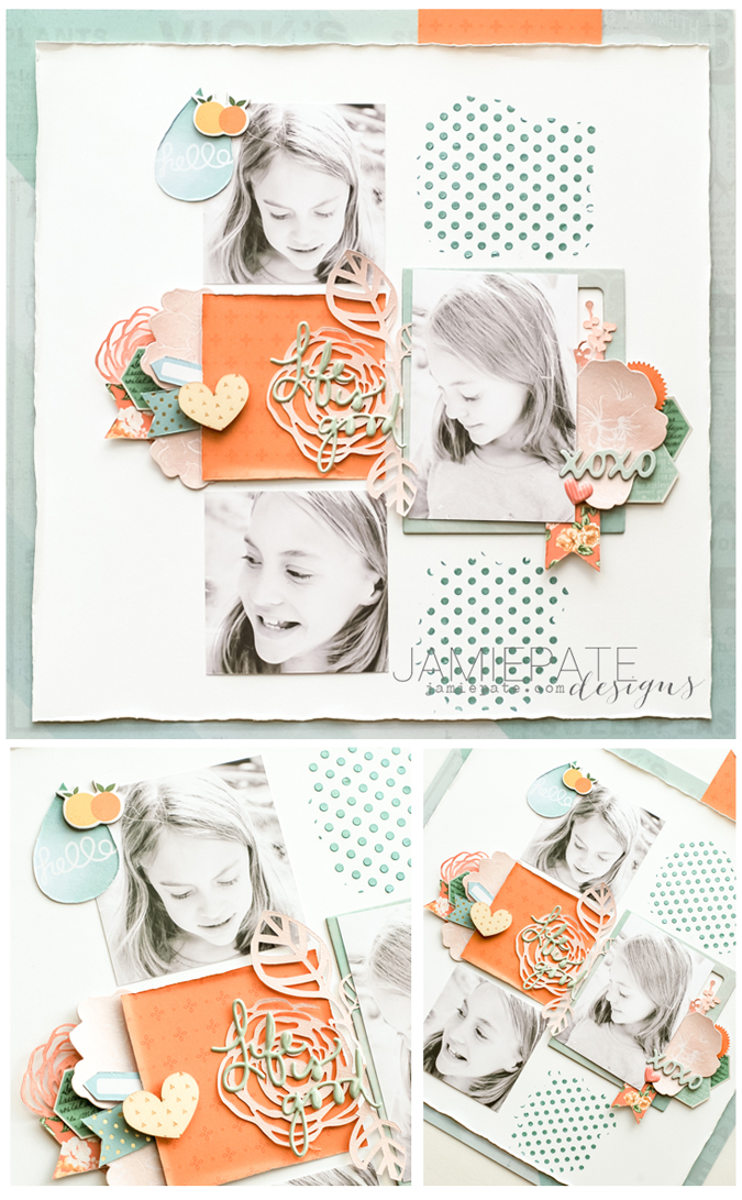
For this page the tones were calmed down just a tad. But PinkPaislee's Citrus Bliss was the perfect collection as the base for crafting this page. The pops of orange and green hues really carried the feel of this story.
The touch of pink came by way of some Heidi Swapp September Skies Color Magic Die Cut pieces sprayed with Blush. Darn that
Blush...it just makes anything so soft and delicate. It really is a beautiful color. Blush Color Shine also colored some of the Die Cut Color Magic paper from the new Mixed Media set found at Michaels. The lift that the die cut gives this layout is perfect.And now for the latest obsession...did I say obsession...because that may be an understatement. The new Mixed Media collection includes this most beautiful Texture Paste, that is like a modeling paste, but on glam steroids. Did I say obsessed? Because pretty sure you can count on finding that medium on many pages going forward. It is just that beautiful.
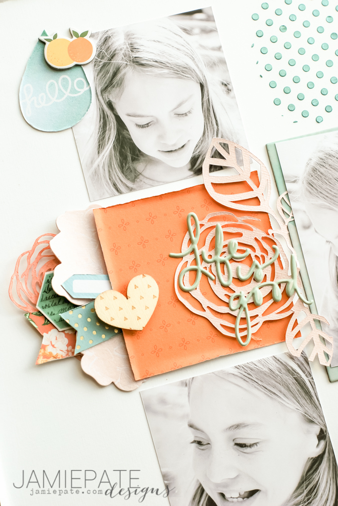
A simple square of Citrus Bliss pattern paper was a great pop of the tangerine found in the mood board. Layered with Puffy Words from that collection as well. Some strips of pattern paper are notched and tucked underneath along with more of the Die Cut paper as well as some stash from Maggie Holmes Open Book.
What happens on one side of a page may very well be repeated on another side of a page. Just a few different embellies, but it basically mirrors what was done on the left. Yeah...layout simplicity at it's best.
Life is good and needs to be celebrated. The story for this page is included in some hidden journaling. Did not want my hand lettering to get in the way. But this was an important moment in time for this girl, and it needed to be recorded and added to her album of memories. My love for paper and color and all things pretty continues to fuel telling these stories. So thankful to Jot for providing fabulous inspiration to do just that.
Till next time...blessings.
misc photos ~ jot magazine
4.15.2015
When I first came upon Jot Magazine I was amazed at the creative beauty that went into that magazine. It is such a wonderful resource of inspiration and ideas for documenting life. Then I dared to apply for Jot Girls 2015... and to my amazement was asked to be apart of that team!
Today I want to highlight one of my layouts from Issue 9.
march mood board ~ jot
3.09.2015
I have said it more than once, I love a great mood board. The Jot Mood Board for March is such a fun and inspirational mix of color and texture and pattern. Loved working with this one again for Jot Magazine blog.
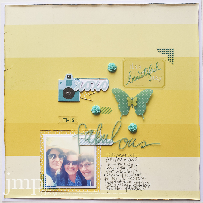
Went with an approach I do not usually take. And that was to use pattern paper for the background instead of a more neutral paper. The mood board was, to me, all about color.
Once this board was out, I knew I had to use a recent girlfriend trip to the Southern California coast as a compliment to these fabulous colors.
Another different approach for me and this page was limited layering. If you know me at all, I have this thing about layering. I wanted to simply share icons and colors to tell this story. The elements are a bit disconnected. But the color and feel of the embellishments keep it all together.
Citrus Bliss from Pink Paislee found plenty of love on this page. See through elements give such a light and airy feel to this mini vacation page. Perfect! You will have to try it!
Now...do you know you have a chance to play along with this Mood Board and win stuff? Check it out over at Jot. And link up. And usher in the feeling of spring with this beautiful inspiration piece.
supplies: pattern paper: Pink Paislee Citrus Bliss. flowers: Studio Calico. photo corner, notched striped tag, camera, clear striped arrow: Pink Paislee Atlas Ephemera. label, xoxo die cut, yellow butterfly, 'it's a beautiful day' clear tag: Pink Paislee Citrus Bliss Ephemera. polka dot butterfly, 'fabulous' clear die cut: Heidi Swapp.
cut files ~ jot magazine issue 9
3.02.2015
What an honor it is to be part of the Jot Girls 2015 team. Truly I am surrounded by a stunning community of creatives. It is always good to be around those that inspire and challenge in a good way to be your very best.
The magazine has several themes one of which was Cut Files. My submission for that category included a couple different cuts from my Sizzix eShape collections. The 'sweet'is found here. The floral vine is found here. The last one is from the SpringToday collection and I thought it was a perfect soft detail against all the Wanderlust from Heidi Swapp that makes up most of this page.
I have sort of shied a way a bit from pattern paper for a background. But this piece here called Paper Cafe just drew me in.
This girl is found reading ALL. THE. TIME. It's a good thing. I know. Capturing her in her truest form made me happy and want to share this moment to remember years from now when her life gets a bit more chaotic. She needs to remember the importance of down time and reading for pleasure and all the joy that is found in this activity.
So here is to the new issue of Jot Magazine. Sweet cut files. And time to pursue good things.
february mood board ~ jot magazine
2.03.2015
We all need inspiration. Inspiration to be better people. Inspiration to eat well. Inspiration to decorate our homes. And even inspiration to create pretty stuff. I love the inspiration found in Pinterest, Instagram and even Facebook. I think we live in a time of amazing visual inspiration to be found all around us.
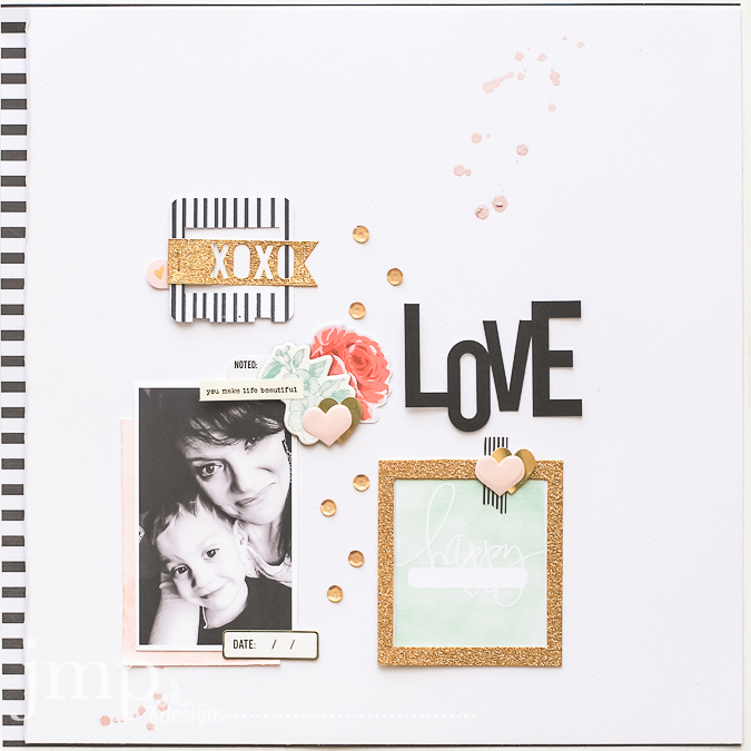
Kim Archer from Jot Magazine put out the most inspiring mood board for February. She found wonderful images that when put together create a visual feast for the eyes. As well as the paper. I loved this board so much. I am sure to find myself creating even more with this board as the month continues. But so far this is what I came up with:
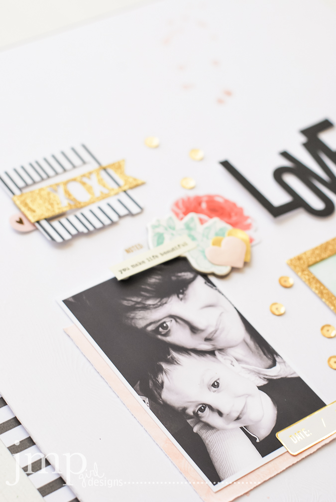
I kept the page fairly white and light. I really wanted the black and white stripes with touches of gold to pop and keep a lot of focus on that little selfie with my littlest guy.
That little guy is my huggy-snuggler. I have never had a kid hug like him. He was all over me this day when it was just he and I home hanging out together. He's a poser, that's for sure. This photo needed a page all to it's very self.
Now to just decide if I keep the page for MY album or give it up to him...hard to know. (oh...and note to self...add the date BEFORE ya take the photo.)
I created the LOVE die cut with my Sizzix Eclips. Now...tech poor skills alert here: when I learn how to host that little die cut, I will be sure to make it available for free to you all. The glitter frame is from Heidi Swapps frames but I cut off the sentiment so to just have a simple square. The 'happy' card comes from her Capture30 class. It just worked with the green that Kim included in the board.
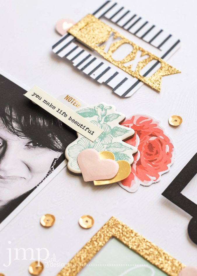
The floral cluster is also a mix of Heidi Swapp. The pink rose is from September Skies and the green chipboard is from last years Hello Today.
The slide frame is also one I created and then added my own marks to it to give it that stripe. And then it's wrapped in a glitter sticker from Heidi Swapp.
Hope you are inspired by this mood board. If you are, and I think you should be, be sure to link it up over at JotMagazine for the challenge over there.
supplies: cardstock: White Wood Grain (AmericanCrafts); pattern paper: Heidi Swapp: Hello Beautiful (black and white stripe), Hello Today (pink blush); Minc Foil machine and embellishments; Glitter Shapes Banners; Glitter Frame; Inspire Lovely gold hearts; Studio Calico gold sequins.
let's fly
1.07.2015
Go here to see the rest of the entries and give it a try yourself!
For this page I picked up the pinks and yellows and charcoal from the mood board image. Pink Paislee Bella Rouge is mostly used to make this page. One of my methods for creating is to hone in on specific colors. Keep the page congruent with specific hues and enjoy that as a creative process. There was such a celebratory feel to the mood board and so sequins were a must have for this page too.
The reason for the page was to introduce my #olw (one little word) for the year: FLY.
I created a cut file and colored with black water color surrounded by splatters for Gold Color Shine. I love the simplicity of the page yet how that word really takes center stage for me.
Words always find their way on my pages. Just about almost always. These word strips from Heidi's collection at Hobby Lobby could never be a hoarding issue for me. I love them all and will use up every bit. Using words to emphasize creativity is huge for me.
A closer look at the sequin and vellum pocket. Just fun and perfect for a celebration type project.
So allow me to sum up a couple of things here...
firstly: go visit Jot and check out what many of the rest of the 2015 Jot Girls created for the mood board.
secondly: do you pick a word for your year? if you never have, I challenge you to do so. And then to join Ali Edward's year long class to keep you connected to your word. I promise you will not be disappointed.
o.k...for now...stay warm!
hello jot magazine
9.02.2013
have you seen jot magazine yet?
it is an absolute beauty of a magazine...
and it's free.
beautifully free.
and beautifully full of eye candy and inspiration and new creatives to meet.
i was a lucky girl and had a chance to submit a layout for the friendship story gallery...
eh hem...page 77.
and what luck!
i just happened to have a little o' layout hanging around that celebrated just that...friendship!
the photo was taken of my friend and i when she was in visiting early in the summer.
we were at the zoo.
and i had just determined, before she came out, that we were going to be better about taking photos together.
we have known each other for 30 years.
she knows the good. the bad. the ugly.
you want something on me...she's got it.
using plenty of Find Your Wings and Fly from My Mind's Eye made this layout come together fairly easy for me.
(the 'you&me' is my own die cut design.)
the format is simple with the use of only one piece of pattern paper yet liberal doses of embellishments on the side.
Gold Lame and Primrose Color Shine attend beautifully to the hues of the colors.
there is plenty of room for journaling which I plan on doing.
and this layout is then set for my friendship album.
yep. i keep a friendship album.
and as i get the chance i create these friendship layouts and place them there...
and count my blessings.
and i hope you do too!
it is an absolute beauty of a magazine...
and it's free.
beautifully free.
and beautifully full of eye candy and inspiration and new creatives to meet.
i was a lucky girl and had a chance to submit a layout for the friendship story gallery...
eh hem...page 77.
and what luck!
i just happened to have a little o' layout hanging around that celebrated just that...friendship!
the photo was taken of my friend and i when she was in visiting early in the summer.
we were at the zoo.
and i had just determined, before she came out, that we were going to be better about taking photos together.
we have known each other for 30 years.
she knows the good. the bad. the ugly.
you want something on me...she's got it.
using plenty of Find Your Wings and Fly from My Mind's Eye made this layout come together fairly easy for me.
(the 'you&me' is my own die cut design.)
the format is simple with the use of only one piece of pattern paper yet liberal doses of embellishments on the side.
Gold Lame and Primrose Color Shine attend beautifully to the hues of the colors.
there is plenty of room for journaling which I plan on doing.
and this layout is then set for my friendship album.
yep. i keep a friendship album.
and as i get the chance i create these friendship layouts and place them there...
and count my blessings.
and i hope you do too!
Subscribe to:
Posts (Atom)