a bit of housekeeping

1.30.2013

a little bit of this and that today.
still getting caught up with life and projects...
but i am almost there...
and will be returning soon back to my regularly scheduled creativeness...

in the meantime::


These boxes are selling fast.
But they are chock full of Heidi Swapp goodness.
So... don't delay. Get them while they are hot.
(and if you don't need them...send any and all disco hearts and stars to me!!!)

also...


{MO}TOGRAPHY
If you missed this class the first time... 
here is your chance.
great apps.
fun challenges.
and an excuse to take more pictures...
and make pretty stuff...

Let me know if you will be joining this time around.

color fever

1.28.2013


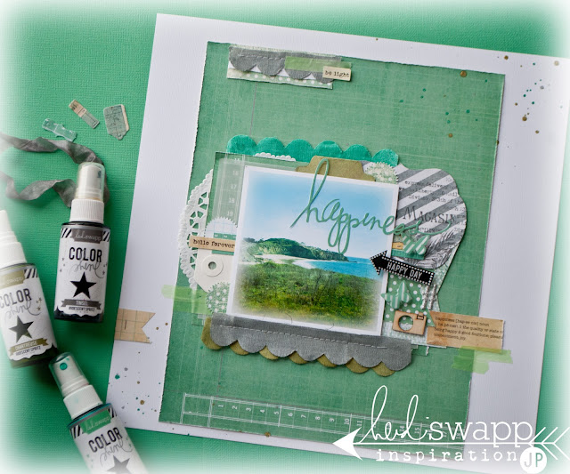
Today's post involves color. Lots and lots of color. 
Today I am posting over at Heidi Swapp and the theme is Color Fever.
We decided to play up Mint Green, Tropicana Teal, Chartruese, and Tinsel.


jmpgirl ~ color fever

For this assignment, I decided to keep things simple (read: just got back from CHA and lots of assignments on my desk not to mention  the priority of my family so this is what I did)...know what I mean?
But seriously, this was to keep the focus on color. And with Color Shine as the foundation of this project, I think I was successful in doing just that.

jmpgirl ~ color fever

 There is a write up over at Heidi's blog. So I invite you to go there to read more about the why of this layout.

jmpgirl ~ color fever

And here I will share with you the how, of this project::

This layout starts with textured white cardstock.
A piece of Vintage Chic pattern paper was used as a secondary background. Trimmed to about 8 1/2 x 11 inches.
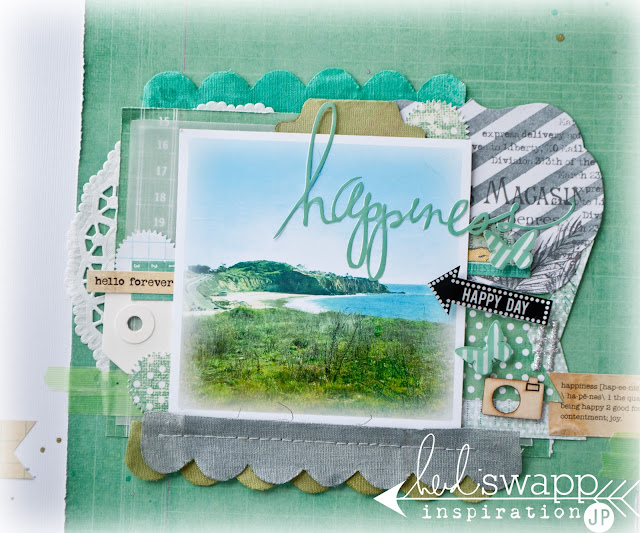
The layers under the 4x4 photo start on the bottom in the following order:
~doily
~a piece of the Bookkeeping Vintage Chic paper
~vellum  - reinforce with the green Day Glow Neon tape at the lower left corner
~notched piece of the dots side of Beautiful Vintage Chic
~place Color Magic Note Card sprayed in Tinsel Color Shine at upper right hand corner of papers
~tuck Vintage Chic Note Card under above Note card at the lower right corner of the papers.
~a 4 1/2 x 2 inch notched Beautiful Vintage Chic paper (the dot side) is layered next
~add pop up adhesive to the photo and place over all papers

Now for some ‘tuck in’ embellishments:
Spray white textured card stock with the Chartreuse Color Shine. Punch with a tab paper punch and tuck behind photo at the top.
Tuck a white small shipping tag and a Vintage Chic Mini Tag under the photo along the left side .
Spray three pieces of scallop Artisan Ribbon with Tinsel, Chartreuse, and Mint Green Color Shine. Layer a top one another and sew to background paper just below photo.
Add Vintage Chic Mini Tags on the Note Card and layer a Buzz Word arrow (“HAPPY DAY”) . Add the arrow with pop up adhesive.
Add BuzzWord butterflies with pop up adhesive.
Place “happiness” BuzzWord to the right of the layers. Add a hash tag from the Glitter Alpha next to the title. Place a “happiness” Definition Sticker below and add Day Glow Neon Tape.
Sew small portion of scallop Artisan Ribbon sprayed with Tinsel Color Shine to top left of layout. Add a strip of Neon Tape with a part of a Sentiment Sticker attached to the top.

When it was all placed, I added splotches of Color Shine in Tropicana Teal, Chartreuse and Tinsel. On Heidi's blog I share how I got those to splotch like they do.

Thanks for stopping in today. Hoping next time is not as much time between posts. Appreciate your comments.

live from cha 2013

1.17.2013


As I sit here in the airport getting ready to depart for home, I am gathering my thoughts from the weekend and the amazing and growing time that it is. I say 'is' because it is still so current and fresh in my mind. This was a dream for me that I spoke outloud and it came through in abundant proportions.


The HeidiSwapp Media Team is one amazing team. Here we are on day one with Rebecca Cross (second from the left) owner of PinkPaislee. And what an amazing joy she is. So full of insight, creativity, energy. Her knowledge of this industry is indeed abundant.  I was also able to spend time with Maridette, (second on the right). She is Heidi's hybrid specialist. I am sure you have seen her creativity showcased on Heidi's blog. She is one hard worker, let me tell you.


And then of course there is Heidi Swapp. Um...hello!!! Can we say all kinds of amazing. What a sweet time of it to hear her speak to us all on dreams and speaking them outloud and making them big enough to scare you. I speak for myself, but I believe that she challenged us all in a mighty way. And that was just the first night!!! Needless to say, I fell in love with her. Even more.


Heidi had three collections to reveal as you have already seen on her blog. This adorable booth was the perfect canvas to be home to many projects showcasing the new products.


This is an inside look at the new Memory File Album. It is 34 pages of yummy. It is so her. This was indeed her pride and joy and we all were so eager to show it off at the show.


This pre fabricated mini album is a little bit of everything: ClearPop. ColorPop. Serendipity. And even a touch of Vintage Chic. It is such a great work of paper love.


ClearPop and ColorPop show themselves off on the display board.


A closer look at the new ColorPop.


Are you seeing the layering possibilities?


 ColorPop Memory Files.


Serendipity and ColorPop.


Serendipity and the new Photo Stack. Cute. Small. Adorable.


One of the make and takes with lots of Serendipity and ColorPop Banner Delights.


When all was said and done, and the show was over...we took off for a day of beach hopping and shopping. As you know, Lindsay on the far left is from Canada. This was quite an adventure for her. Then Jen was from Oregon, but needed a dose of a 'real' beach. Maggie, on the very far right, had never been to California. And me..having grown up in southern California, was just tickled to have a day out visiting the coast that I love so much. So first top, Newport Beach.


Then the Beachcomber for a fabulous breakfast at Crystal Cove. If you follow me on instagram, you know what I am talking about. (Photo taken by HeidiSwapp).

Then we stopped in at Sprinkles for a cupcake snack. Oh. My. Good!


And then a trek to The Lab Anti Mall. And here is our last photo together of the day. Don't we look like our own ColorPop? These girls are some kind of wonderful. And I am so lucky to have had the chance to get to know them on an even better level.


However, our number was not complete. Our friend and team member Kim Jeffress had to cut her trip short as she had a family emergency. We were not the same without her. I am so happy, though, for the meal we did share together, and our evening of making a memory file together. Good times for sure. I hope she too enjoyed it as much as I.

Just a little peak into a big week. And for now, I am ready to be home. To see all my babies. And put all my mind's thoughts to work. Big dreams are to be had. Big dreams are to be spoken. Big dreams are to be made possible.

on my way...

1.10.2013


chalkart insta kit from RhonnaDesigns

i am so happy.
i am so excited.
i have adventure ahead.

i have always wished/desired/wanted (can we say dreamed?) to attend CHA...
and it all just came together so beautifully this past fall to make plans to do just that.


but not only that!!!
even way better than that!!!
i have the opportunity to meet every member of the Heidi Swapp Media Team...
irl!!!
(that's in real life, people.)
 
 Photobucket
 
 
i am sure we are all like giddy school girls as we all make our way from the four corners of the earth to invade land in Anaheim California for this event.
i mean...literally.

Kim is coming from Brisbane Australia...
 

Lindsay from Canada...can we say 'eh?'...
 

Jen from Oregon...
 

Maggie from Chicago-land....
 

and of course Heidi will be there from the great state of Utah...

and little o' me from Colorado.

sigh...
still much to do...
to do list slowly getting crossed off...

and speaking of #CHA2013...
have you been watching for any of Heidi's sneak peaks...
she has several new collections coming out...
here is a peak at a few::
 
serendipity.
 
color pop.
 
 
just a few sneaks. 
many more on her blog...
and a giveaway was announced yesterday.

do you have a favorite?
would love to know.
 
have a fabulous rest of the week.
i will pop in here tomorrow with a recent layout...
and hope to be posting from CHA.
follow me on instagram  (see top of menu bar) to see what's happening in SoCal.


project life 2013

1.09.2013

  welcome to project life 2013...

jmpgirl ~ project life 2012 cover

i love fresh starts.
and project life is another fresh start for me.
this will be my third year creating this album.
as i have said before...this project is a committment...
but one that is well worth the effort.
i love. my family love. my friends love looking over these books.
i keep these albums out and very accessible.
so we are looking at them all the time.

jmpgirl ~ project life 2012 cover

the first inside cover page is a hybrid or sorts.
the pattern paper was created using RhonnaDesigns stamps and fonts.
the family photo was the inspiration for the color.

the silhouette cut of 'our life' was made using the Bebas font and was inspired by what Adrienne did here on her cover page. i was even loving that diagonal paper too. you'll see how i did that.

for the upper right polka dot paper i did this::
opened a 6x4 document in photoshop elements.
i kept it white.
i then opened the polka dot stamp texture from the TexturesBrushKit .
i stamped the document with a grey color.
i printed out on textured white cardstock.
it looked like this::

ignore the clock. decided not to use.

jmpgirl ~ project life 2012 cover

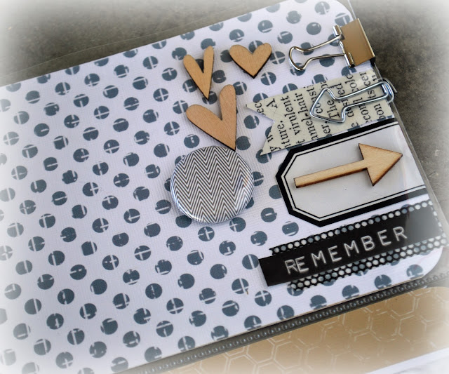
arrows and hearts from studio calico + arrow clips and binder clips + notched paper and labels and words add a bit of detail to this page. i love embellishing like this.

the gold paper was made the same as above except when I created the 6x4 document, i then filled it with the gold color and stamped it with the honeycomb stamp from the TexturesBrushKit.
it looked like this when done::


the paper shown in the lower left pocket was made from Rhonna's new InstaPOP fonts and stamps.
again, another 6x4 document was created in photoshop elements and kept white.
then i added the png image from the InstaPopKit.
before adding it to the 6x4 i changed the color.
it looked like this when done::


finally i made the black and white diagonal pattern by adding the SpookyPrintablePaper to the 6x4 and then tilting the pattern.
it looked like this when done::


it's like making my own pattern paper. love the flexibility of this.

the tag was made by adding the png image from the InstaGoalsKit.
i added it to a blank document.
printed that out on copy paper.
then i taped the manila tag over the image.
and ran it back through the computer again.


jmpgirl ~ project life 2012 cover

and that little guy is just about as fun as that black&white stripe.

so glad for this project.
so glad for what it means to my family.
so glad for the habit created to make it happen every week.

i hope if you have discovered this project life concept of documenting your life that you find it as fulfilling as we do.

be happy

1.07.2013

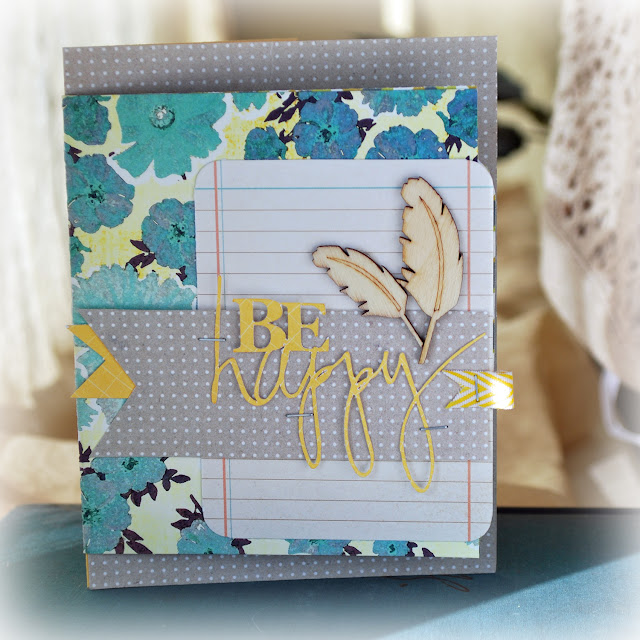
jmpgirl ~ be happy card

it's a brand new day.
it's a brand new week.
it's a brand new academic semester for us folks here.

jmpgirl ~ be happy card

this little card is my mantra today.
be happy.
even in the challenges of a busy and oft crazy day.

jmpgirl ~ be happy card

made this card recently for a dear friend.
she always makes me happy.
i used the Sock Hop card kit from Studio Calico.
i also used Crawford pattern from Darling Dear because it is just so gorgeous.
i added a glassine bag inside to hold a journaling card to add some extra words.
i love adding an interactive piece to a card.

now go...be happy today.
and make someone else happy along the way.

inside day by day

1.04.2013

Hello friends...
thank you for dropping in again to see inside of yesterday's journal.
today I want to share with you a bit of the inside, and why this journal is such an important daily part of my life.

jmpgirl ~ inside day by day journal

when the journal is first open i have placed my digital graphic of my one little word front and center.
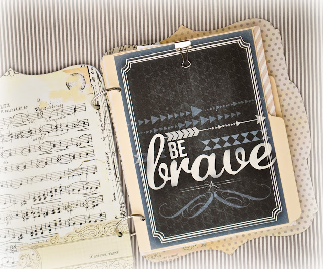
i need to see this daily as a reminder of my word. as a reminder of my focus. as a reminder of what to do. it's a guiding force and so adding it to this book that i open up everyday is very important to me. i sized the printable to 5 x 7 and and adhered it to the first manila folder index page.

jmpgirl ~ inside day by day journal

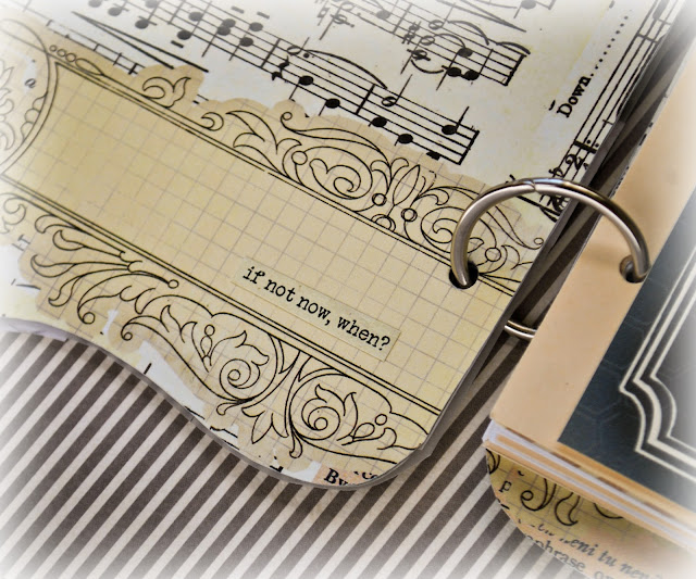
these sentiment stickers are perfect word stickers. i don't know about you, but i need a lot of reminders. i am very visually driven, so to have a little reminder asking me 'if not now, when',  then i am bound to be challenged and inspired.

jmpgirl ~ inside day by day journal

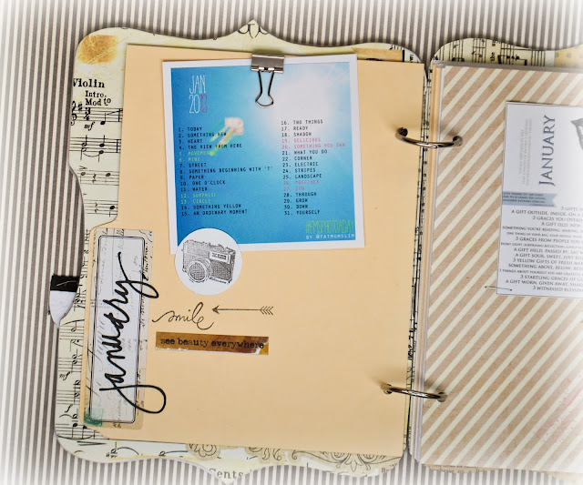
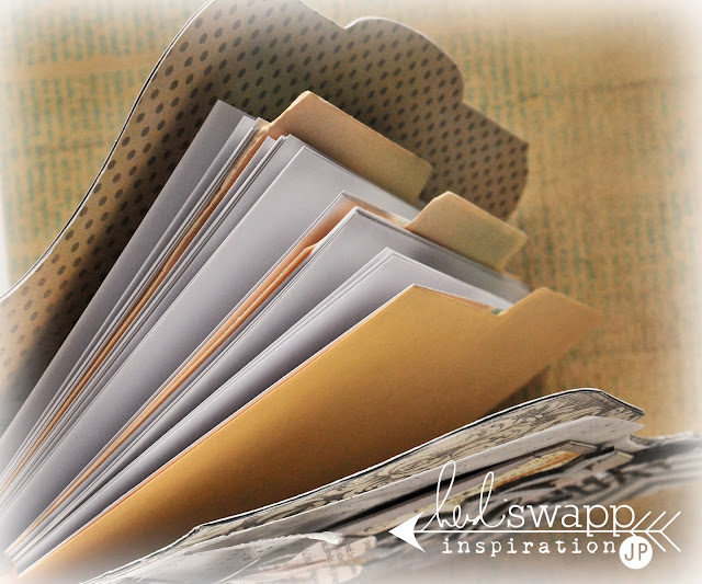
you can see here how I have taken a regular manila folder, and trimmed it to size. i use these to divide the months. if you remember from yesterday's post over at HeidiSwapp that these journals hold three months at a time. i divide them up to further help me keep track of my writings. i dressed up this page just a little by adding (as i always do) fatmuslims photo a day graphic. i always print this out and add it to my journal to refer to daily.
i also used the month cutting file from HeidiSwapp's Digital Shop for mark the month.
then a few of her ClearStamps were used to just add a few details.

jmpgirl ~ inside day by day journal

here is something else that is always included inside my daily journal: Ann Voskamp's Joy Dare. i have been listing my gifts daily for well over a year now. last year i wrote my 1000th gift. these prompts are perfect to promote thought and help me be mindful of the daily gifts of my life. part of my morning routine is to check the suggestions listed here and write out several thoughts that i am thankful for and consider as gifts.

jmpgirl ~ inside day by day journal

as this journal has made it's way around the creative world, several of you have mentioned being challenged to journal. i would consider this joy dare to be a great prompt to get you to do just that. it can be bullet points. it can be full on essays if you wish. it is up to you. but the beauty of writing daily what and where you are in your current life is such a wonderful way to put your heart down on paper. good. bad. or ugly. and i hope you are inspired to do the same.

day by day

1.03.2013

jmpgirl~day by day journal

I am over at HeidiSwapp.com today sharing my latest journal inspiration. Hope you will hop over and check out the details there.

jmpgirl ~ day by day journal

But here today I share the step by step for this art journal-mix media inspired book.

jmpgirl ~ day by day journal

You have to go over to Heidi's to know about the why of the book...

jmpgirl ~ day by day journal

But here I will share with you the how of the book.
Ready for a little bit of eye candy?
Here we go::

This journal starts with a Mini Memory File + Chipboard Memory File. These items are so versatile and this is not the first time I have made journals with them. Today I will share with you the details of the cover. And tomorrow I hope you will come back and see how I really personalize the inside and make this such an important go-to book in my day.


1.Cut Mini Memory File in half.
2.Cut Chipboard Memory File in half to match Mini Memory File.
3. Attach Mini Memory File to front half of cut Chipboard Memory File. Do same for back portion.
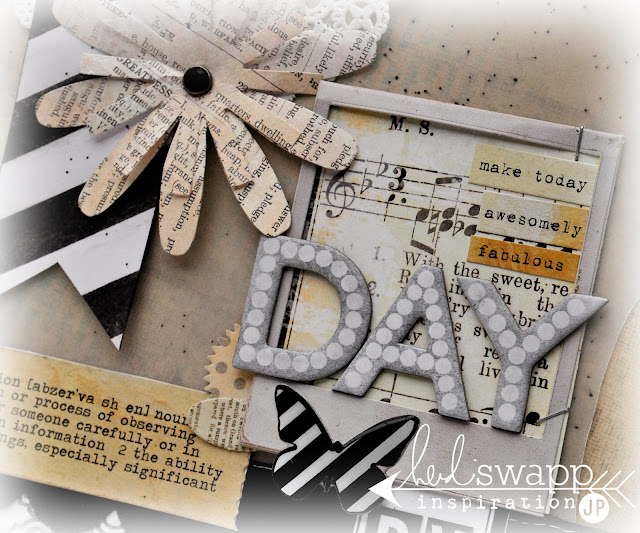
4. Cover inside of Chipboard Memory File with Vintage Chic paper in Just Dots and Beautiful Songs.


5. Trim piece of vellum to shape of front cover. I adore the pattern of the black damask Mini Memory File...but I wanted it to be a bit subtle. So all the elements are attached to the vellum.


6. Sew doily and notched Color Magic Paper top left corner.
7. Spray Black Velvet Color Shine on vellum.
8. Place rhinestone brad through middle of two Flower Trimmings. Adhere to layer on top of doily and notched banner.


9. Spray a piece of Color Magic Paper with Tinsel Color Shine. Adhere to lower right corner of vellum. Trim off extra.
10. Spray scalloped Banner Delights with Black Velvet Color Shine. Overlap the Color Magic Paper.
11. Spray scallop Artisan Ribbon in Black Velvet Color Shine. Sew on vellum overlapping the Banner Delights.


12. Insert piece of Beautiful Songs pattern paper inside Mini Instaframe. Staple to vellum.  Cut up a Sentiment Sticker and place inside Mini Instaframe.
13. Spray Chipboard Alpha to spell the word “DAY’ with Tinsel Color Shine. Attach to sit inside the Mini Instaframe.


14. Color Letterbox Alpha with Black Velvet Color Shine. Print a black Color Label from the Digital Shop. Attach Letterbox Alpha’s to label and tuck under Mini Instaframe to attach.
15. Place Buzzwords butterfly on Mini Instaframe.


16. Add an Artisan Chipboard Arrow to cover. Keep white.
17. Place "DAY" Black & White Stickers next to Chipboard Arrow.

Fill inside with filler paper. I use 65 lb presentation card stock from the office supply store.
Separate the months with manila folders trimmed to fit book size.
Punch holes on edge and use ring binders to hold.
More details tomorrow on what's inside.